Dine N’
Bash
Type: Team
Role: UI/UX Designer, Level Designer
Length: 7 months, Ended July 2024
Publisher: DigiPen Institute of Technology
Game Overview
This single player, high paced food delivery game is bound to get you addicted. The game follows a tavern keeper hoping to make it big in uncharted territory. The player’s goal is to serve picky customers and avoid the incoming projectiles from those who are becoming a bit too impatient. The simple food delivery and weapon dodge systems work well to keep the player on their toes for the entirety of each level
I joined this project 3.5 months into this 11 month project.
Play on Steam here!
Team logo made by Ridley Liu
Preparations
Personas
To catch myself up on a project I joined halfway into development, I combed through all existing design documentation, played all the existing content, and analyzed the playtest reports. This helped me find imperfections in the design and create the following personas
These personas went on the wall of our team space next to the task board, reminding us of our design goals.
UI Iteration
Because I was not the main UI designer on the team, I spent most of my time on the implementation. However, I did help narrow down the designs and give pointers while my partner, Bren Hermann worked in Figma. There were also some designs I changed in the final product…
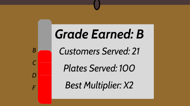
For example, The ending screen’s original design is pictured below:
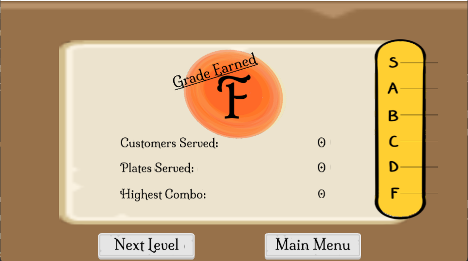
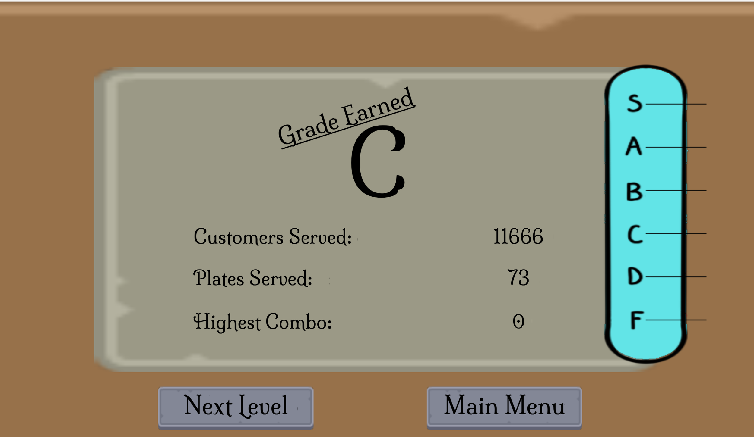
This is the ending screen’s final design, designed by me:
The main issue was how the information was conveyed. The most important information, the grade was not as big as it should have been. Second, infomation in the original design did not take up much screen space. In my version they are more spread out and there is more visual balance. I was also able to add the buttons to the bottom.
Here is some of the design iterations this screen went through:
Other UI challenges
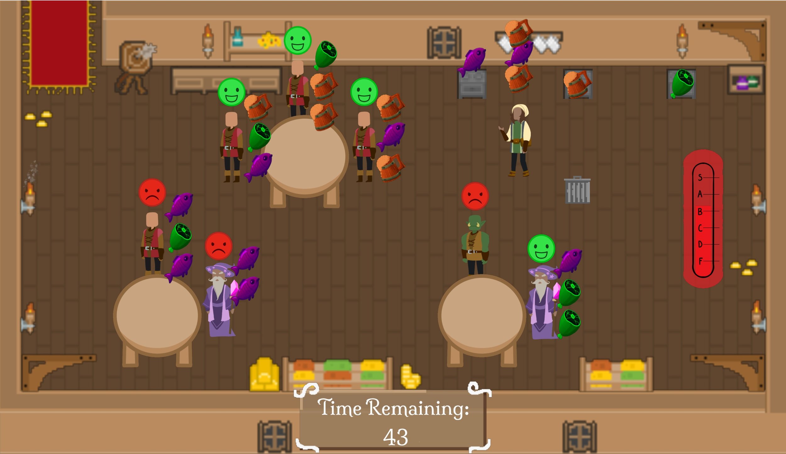
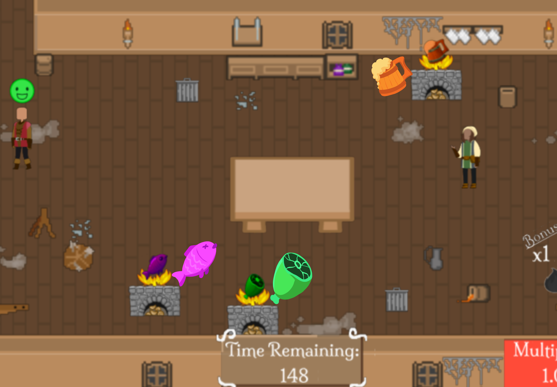
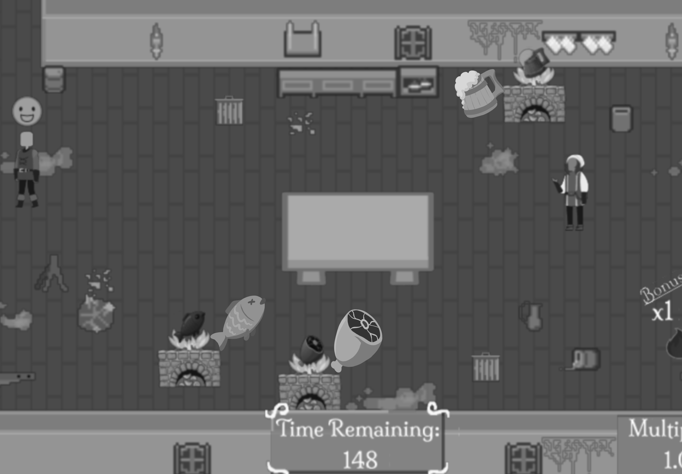
Once the rooms got populated with customers ordering one to three items, the rooms also became populated by many colors. As Kahneman’s capacity model illustrates, the player’s cognitive load became too large and overwhelming.
To reduce this, we desaturated the colors which, when applying a greyscale filter, revealed it was not color-blind friendly. To change this, I asked Ridley Liu, our team's artist and systems and gameplay programmer, to simplify the icons and desaturate the trashcan items.
UX and System
Iteration
The biggest change made to the game was the health system that became a score system and multiplier
Problem:
We wanted to punish the player if they got hit by the bullets, but not break the pace of the game
In the first prototype, players would lose health with each hit, causing a time-out that players would mistake for death.
We scrapped the health system in favor of adding a score with a multiplier and streak. Now when the player got hit, it would reset the multiplier and slow them down temporarily, lessening the pace break.
Solution:
I helped here by pointing out the issue from reading the reports and theming the score display. In the final version, I helped place each UI element including the time, score multiplier, and thermometer.
This score system improved the pacing and aligned better with our engagement types, as it encourages players who enjoy challenge to retry until they get the best score and multiplier.
Reflection
Throughout this project, I improved my communication and collaboration skills. I saw benefit from going out of my way to help my team in areas I was not as comfortable in. This usually meant asking what programming still needed to be done in the custom engine to get features from the prototype into the game. Especially on the UI front, I can now implement UI with my C++ knowledge and iterate on existing models with my improved design methods. Since there was a lot of problem-solving to be done on both the design and programming front, I came out of this project as a more equipped designer.


